 Skip to content

When you design a website, screen size and screen resolution often get mixed up, but they are not the same thing. Screen size refers to the physical dimensions of a display, while screen resolution is the number of pixels shown on that screen.
Both terms matter because they directly affect web design, user experience (UX), and search engine optimization (SEO). A design that looks sharp on one device can appear distorted or unreadable on another if these factors are not considered.
In this guide, you’ll see real numbers, learn the key differences between size and resolution, and discover how to design websites that adapt effectively across devices.
What Is The Average Browser Size?
Browser size refers to the viewport, the visible part of a web page inside the browser window. It’s different from screen resolution, which measures the total number of pixels on a device. Screen resolution is hardware-based, while browser size changes depending on whether the user resizes the window, uses full-screen mode, or views content on a smaller screen.
The most common browser sizes vary by device type:
- Desktop: 1366×768, 1440×900, 1536×864, and 1920×1080, though most users don’t keep their windows maximized.
- Mobile: Around 360×800, 390×844, and 414×896.
- Tablet: Typically 768×1024, 810×1080, and 820×1180.
Understanding browser size matters because it dictates how much of your content appears above the fold, the portion users see immediately without scrolling, which directly impacts engagement metrics like clicks, time on page, and conversion rate.
What Is Screen Resolution?
Screen resolution is the total number of pixels a device can display, usually expressed as width × height (for example, 1920×1080). The higher the resolution, the more pixels fit on the screen, which directly affects clarity, sharpness, and how images or text scale.
Common resolutions include:
- Desktop: 1920×1080, 1536×864, 1366×768
- Mobile: 360×800, 393×873, 412×915
- Tablet: 768×1024, 1280×800
Why does this matter? Resolution determines how crisp visuals appear and how web elements adjust across devices. A design optimized for one resolution may look blurred, cramped, or oversized on another, making screen resolution a core factor in responsive web design and overall user experience.
Browser Size Vs. Screen Resolution: What’s The Difference?
| Feature | Browser Size | Screen Resolution |
| What It Is | Actual browser window (viewport) | Device’s pixel dimensions (hardware) |
| Example | 1366×768 browser window | 1920×1080 screen |
| User Control | Can resize/minimize/maximize | Fixed by device |
| Impact | Content visibility & layout | Image sharpness & scaling |
| How To Measure | DevTools, online tools, GA4 viewport | Device settings, GA4 resolution report |
Why both matter: Browser size → what’s visible, Screen resolution → how clear it looks.
Why Average Browser Size Matters For Web Design
Content visibility: A browser’s viewport limits what users see first. Key elements like calls to action, navigation menus, and headlines need to fit within this space to capture attention immediately.
Responsive layouts: Designing only for screen resolution isn’t enough. Websites must adapt fluidly to different browser sizes, ensuring layouts remain usable whether on a full desktop screen or a resized mobile window, an approach that directly supports strong Mobile SEO.
User behavior: Many desktop users don’t keep their browsers maximized. Ignoring this can lead to hidden menus, awkward spacing, or broken designs that frustrate visitors.
Performance: Optimizing for the viewport allows developers to prioritize visible content, reduce unnecessary loading, and improve page speed, key factors for both user experience and technical SEO.
Why Screen Resolution Matters For User Experience
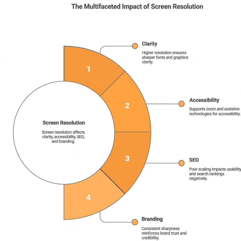
Clarity: Higher-resolution screens deliver sharper fonts, images, and graphics. This makes reading easier and ensures visuals look professional rather than pixelated.
Accessibility: Adequate resolution helps users zoom in without losing quality and supports assistive technologies such as screen readers. This is especially important for visually impaired visitors who rely on clear, scalable content.
SEO: Google prioritizes mobile-first and user-friendly design. If a site scales poorly across different resolutions, it can hurt usability and lead to lower search rankings.
Branding: A blurry or distorted design creates a negative impression. Consistent sharpness across devices reinforces brand trust and credibility.
How To Check Your Browser Size And Screen Resolution
There are several quick and reliable ways to find out both, whether you’re a casual user or a developer:
Quick Check (Non-Technical)
The simplest way is to use an online browser size checker. These tools instantly display your current viewport dimensions. You can also manually resize your browser window to see how your site’s layout reflows at different sizes.
Developer Tools (Fast)
Modern browsers make this easy. In Chrome, open DevTools and click the “Toggle Device Toolbar” to view your site on different screen sizes. Firefox and Edge include similar options, letting you test multiple resolutions and viewport widths without leaving your browser.
Analytics
- Screen resolution: GA4 automatically reports common screen resolutions under “Tech details.”
- Browser size: This requires a custom GA4 setup with Google Tag Manager, where you capture viewport dimensions as a custom event. A short configuration adds ongoing tracking of how visitors actually view your site.
Responsive Testing Tools
Platforms like BrowserStack, website responsive testing tool, and Screenfly let you test real-world devices and browser combinations. These are particularly useful for QA teams checking design consistency across desktops, mobiles, and tablets.
Best Practices For Designing With Browser Size & Screen Resolution
Design mobile-first: Start by designing for smaller screens, then scale up for tablets and desktops. This ensures your site remains usable on the devices most people browse with.
Use responsive grids: Frameworks with 12-column grids, percentage-based widths, and CSS pixels help layouts adapt smoothly across different browser sizes.
Choose safe container widths: For desktops, a max width between 1140px and 1200px is widely used. This keeps text lines readable and prevents layouts from stretching uncomfortably on large screens.
Set breakpoints wisely:
- 320px: small smartphones
- 768px: tablets
- 1024px: smaller desktops/laptops
- 1280px and above: large desktops and wide screens
Optimize images: Use responsive image attributes (srcset) and ensure support for Retina/HiDPI displays so visuals stay sharp across resolutions.
Test across devices: Simulators are useful, but nothing replaces testing on real devices. This helps uncover issues with touch input, viewport quirks, and hardware-specific rendering.
Prioritize critical content above the fold: Calls-to-action, navigation, and key headlines should remain visible within average browser sizes to capture attention without scrolling.
Common Mistakes To Avoid
Designing only for 1920×1080 screens: Many designers optimize for full HD, but most users view sites in smaller browser windows. Ignoring this leads to broken layouts and hidden content.
Fixed-width containers: Hard-coding widths (e.g., exactly 1200px) prevents pages from adapting fluidly. Responsive containers should scale with percentages or relative units.
Ignoring mobile-first: Skipping mobile-first design results in poor usability on small screens and can hurt SEO, as Google prioritizes mobile-friendly sites.
Using Retina assets incorrectly: Uploading oversized graphics without optimization doubles file sizes and slows performance. Assets should be responsive and compressed for HiDPI displays.
Forgetting accessibility: Overlooking zoom support, font scaling, or color contrast makes sites harder to use, especially for visually impaired users. Accessibility should be built in, not added later.
Conclusion
Browser size and screen resolution are not the same, but both shape how users experience a website. Browser size defines the visible area of a page, while screen resolution determines clarity and sharpness.
By knowing the average browser sizes, you can plan what users see immediately, making sure critical elements like navigation and calls-to-action appear above the fold.
Designing with both factors in mind leads to stronger user experience, improved SEO, and better overall performance across devices.
FAQs
1. What Is Considered A Standard Browser Size For Desktop?
While browser sizes vary, a standard desktop viewport is typically around 1366×768 pixels. However, many users resize their windows, so designing responsively is more effective than targeting a fixed size.
2. Is 1440×900 A Good Resolution For Web Design?
Yes, 1440×900 is a common laptop resolution that provides a good balance of clarity and workspace. Testing your design at this size helps ensure usability across mid-range displays.
3. What Is A Good Image Size For Web Use?
A good image size depends on layout width, but most designers aim for 1200–1600px width for banners and keep files under 500KB. Use responsive image attributes like srcset to maintain sharpness on all devices.
4. What’s The Difference Between Full HD, QHD, And 4K Resolution?
- Full HD (1920×1080): Standard resolution for most monitors.
- QHD (2560×1440): Sharper, used in premium displays.
- 4K (3840×2160): Ultra-high definition, ideal for large or Retina screens.
Websites should use scalable, high-quality assets to support all.
5. Is 1366×768 Outdated?
Not entirely. 1366×768 remains common on budget laptops and older monitors, but newer devices increasingly use 1080p or higher. Your design should still render cleanly at this smaller viewport.
6. How Can I Make My Website Fit All Screen Sizes Automatically?
Use responsive web design techniques such as flexible grids, percentage-based widths, and CSS media queries. Frameworks like Bootstrap or Tailwind CSS make this process faster and more consistent.
7. What Is The Ideal Aspect Ratio For Web Design?
The 16:9 aspect ratio (used in 1920×1080 and 1366×768) is most common, but websites should adapt well to 4:3 and taller mobile ratios like 19:9 or 20:9 for modern smartphones.
8. How Do Screen Sizes Affect SEO Rankings?
Google’s mobile-first indexing means how your site performs on smaller screens directly affects rankings. Poor scaling or unreadable layouts can increase bounce rates and reduce visibility in search results.